
SwiftUI Divider Colors & Thickness
Another SwiftUI post coming your way! This time we’ll take a look at Divider and how we can change its color.
TL;DR You need to add an overlay with a color, like this:
The overlay will cover the default gray divider (which we can’t currently change) and you’ll keep the cool functionality of dividers too (changing layout based on a VStack or HStack parent). Note that you probably won’t want to use colors that are less than 100% opacity because you’ll see the gray divider color come through behind your custom color. More on that below.
If you’re interested, here are some ways NOT to change the divider color:
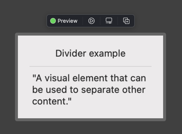
As nice as it would be to change the divider color with tint or foregroundColor, we can’t do it that way 😭 Maybe one day?? (looking at you SwiftUI developers)
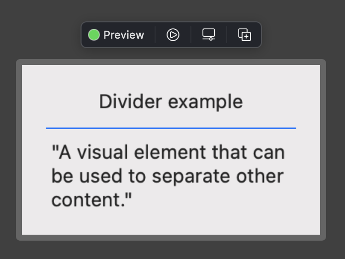
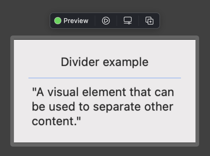
We could also try a background color on the divider, as I’ve seen some other internet tutorials recommend. If you’re not paying close attention this seems to work okay, but it’s only because the divider is semi transparent & your color will show through like it’s behind a dirty window:
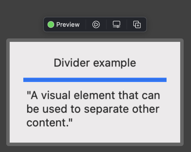
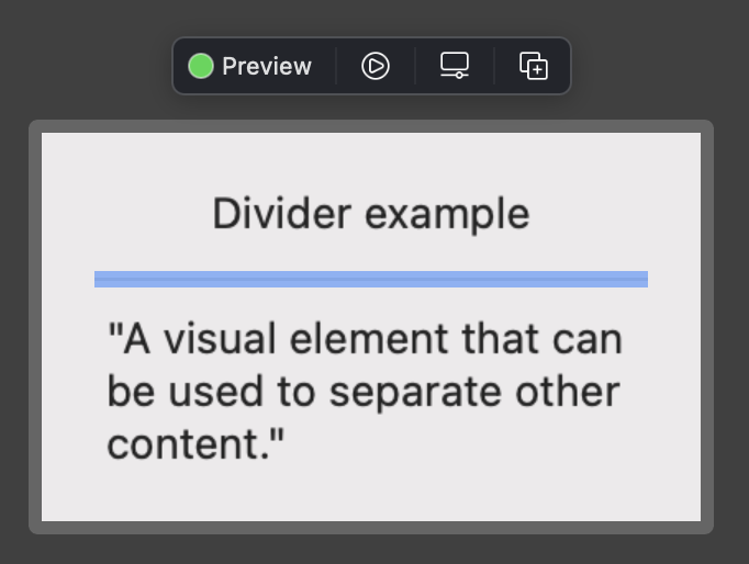
This problem becomes much more apparent if we adjust the minimum height of a horizontal divider:
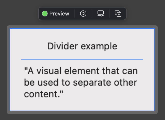
The system divider’s transparent gray is going to cover any background color we add, so our final resort is to use an overlay on the divider:
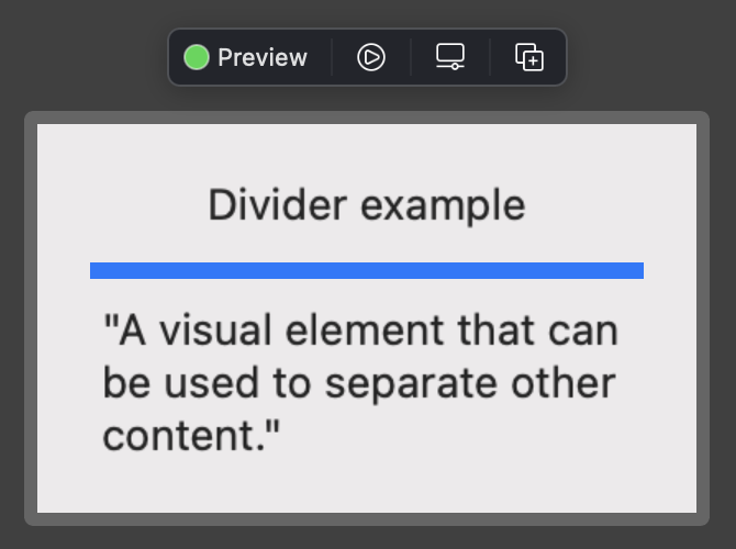
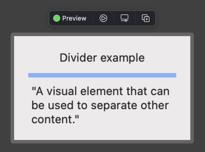
Great! No more gray overlay from our stubborn divider. Now let’s remove the minHeight and enjoy a vibrant blue divider that’s the same size as a default system divider:
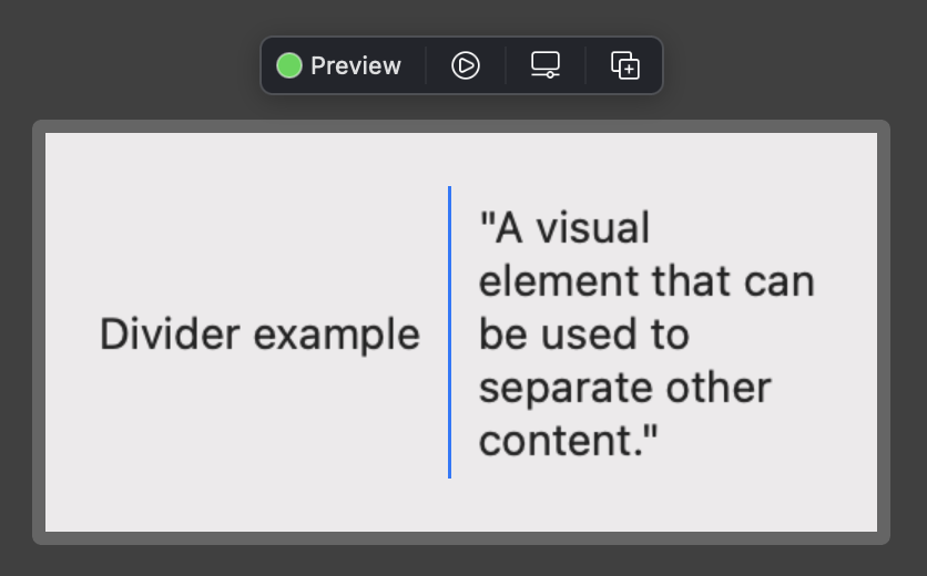
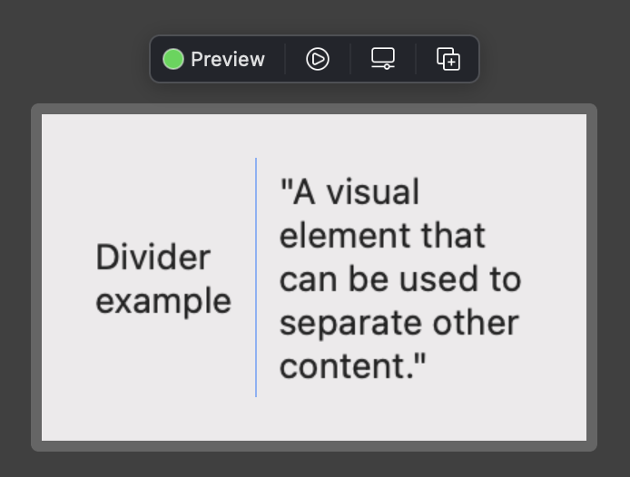
If we decide our layout should use an HStack rather than a VStack, our colored divider will change its layout accordingly:
One final thing to note - if you want to use a semi-transparent color for your dividers, you will end up with a grayish tint because of the system gray divider showing through. The example below uses a wider divider so you can see the problem more easily:
In the case where you want a transparent colored divider, it would be best to create your own custom divider view, like this:
Then you could use the divider like so:
To be sure this custom divider looks great at any thickness, let’s try our 5 pixel height again:
Looking good 😎
Notice that I named our custom divider HorizontalDivider because it has a fixed height. The system divider uses secret SwiftUI sauce to read its parent’s layout (VStack vs HStack) and set its height or width accordingly. Unfortunately we don’t have access to the secret sauce so we’ll need to specify horizontal vs vertical when we create our own custom dividers. So last but not least, let’s see the code for a custom vertical divider:
Here it is in use:
I don’t know about you, but that was a longer post that I would have expected on divider colors! I hope you enjoyed it & found something you can put to use in your own apps. See you next time ⌚️