
SwiftUI Alert With Styled Buttons
SwiftUI is the best thing since sliced bread, but I often come across simple problems that take longer than expected to sort out. Take for example an alert where I want to style the buttons. In my specific case it was a confirm logout alert inside my Wordie app, so I wanted a red “confirm” button along with a “cancel” button that has a regular tint color and preferably a bold font.
For a while I used regular buttons in the alert actions closure like this:
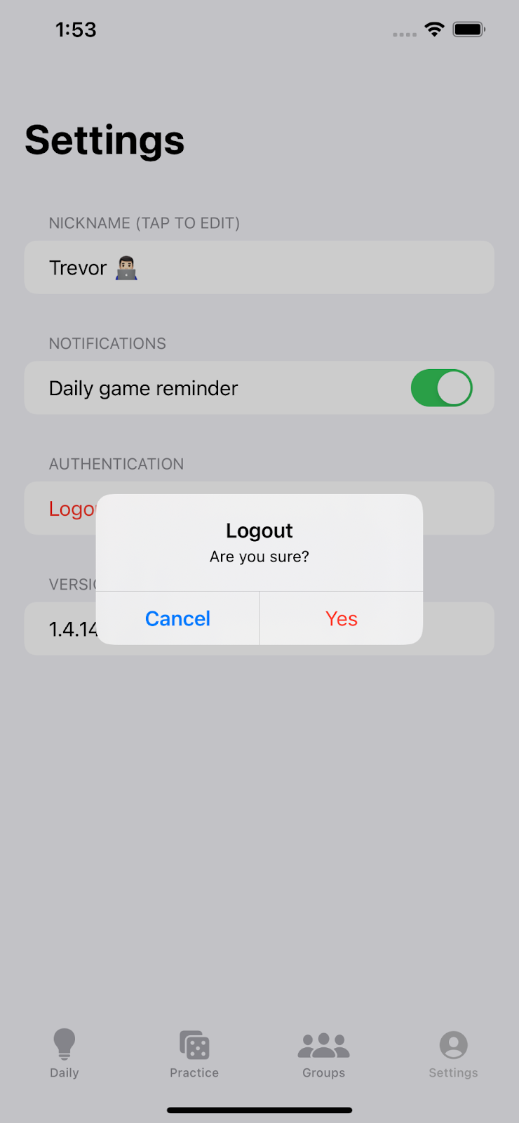
The code above worked but wasn’t pretty:

Any attempt to change button color or font weight was utterly useless. I tried foregroundColor and tint on both the Button and its Text label, but no colors changed. Font weight didn’t seem affected either:
Initially I threw in the towel after a few hours of searching for an answer, leaving my alert looking lame with vanilla system blue buttons. It wasn’t ideal but hey, it worked. I eventually came back to the alert because the UI was still bugging me - and this time I tracked down the answer. The key lies in the Button initializer method, a specific one where you pass in the button role (“cancel” or “destructive”)
Finally my app looks like it could be designed by Apple 🥳
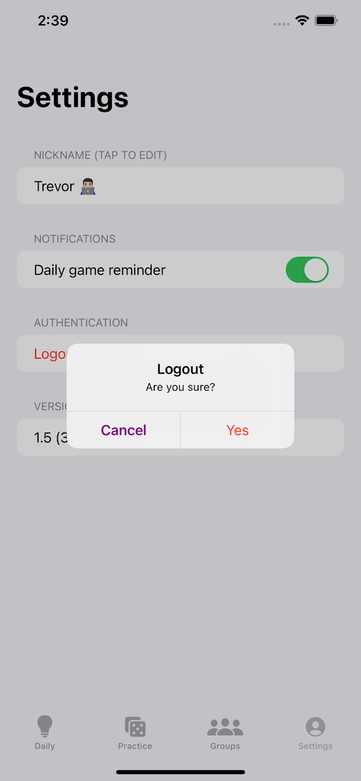
One more helpful tip - if you want to change the color of the non-destructive alert buttons you can add this single line to your app, somewhere that it will be run before your alert shows. Note that it will change the color of all alert buttons in your app (probably a good thing if you like consistently colored UI).
For example, you can put this line inside your @main struct if your app uses the SwiftUI lifecycle:
Or you can put the code inside the app delegate’s application(_, didFinishLaunchingWithOptions) method:
Here’s the final colorful result:
There you have it - now you can go crazy (sort of) with your SwiftUI alert styling. See you next time!